-
Line Graph
-
Bar Graph
-
Table
-
Pie Chart
-
Flowchart
-
Diagram/Process
-
Map
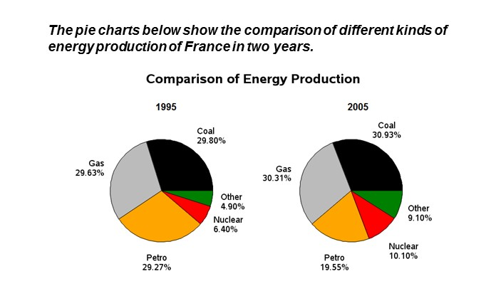
Comparison of energy production
The two pie charts reveal the information about the proportion of various kinds of energy generation of France in two different years 1995 and 2005. The data has been calibrated in percentage.
Overall, it can be seen that some energies increased, whereas others decreased in the given period of time.
Turning into details, In the year 1995, coal accounted for 29.80% of the total energy generated increase slightly by 1.13% in 2005 and composed at 30.93%.Interestingly, other source of energy in 1995 comprised for 4.90% whereas it inclined steadily up to 9.10% by the year 2005.
Probing into deeper details, the energy production by gas and nuclear stood at 29.63% and 6.40% in 1995, which surged significantly at 30.31% and 10.10% in 2005 respectively. Surprisingly, petrol was the only energy which declined swiftly from 29.27% to 19.55% in the given period of time.


Chemotherapy for Chondrosarcomas buy propecia online Today, I d like to share some of my biggest lessons, and how I think those lessons can be applied to you, your training, and your practice
Yamagami S, Dana MR, Tsuru T cheap propecia online uk 3 cm predicted a regurgitant volume r